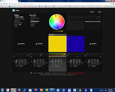
It seems too easy! Just to satisfy my need to look at how these colors are arranged on the color wheel, I returned to Kuler to play around with their interactive wheel. To get there, click on "Create" and then on "From a Color." Wow! What fun it is to slide around the wheel creating an infinite number of color combinations!
Here is the photo of the temari I stitched with the daffodil palette and Kuler's selection of colors. I did a little tweaking by moving the circles in the photo until I got the colors from my daffodil photo.
 |
| Daffodil palette - green, blue and yellow/orange |
Two of the main colors in the palette, yellow/orange and deep blue, are directly opposite each other on the wheel so they are complimentary. I clicked "Complimentary" to reach this screen:
 |
| Complimentary colors are opposite on the wheel |
Then click on "Analogous," set the main color as green, and slide the dots so there are two shades of blue and two shades of yellow/orange.
 |
| Analogous colors are side-by-side on the wheel |
It's nice to know why I like this group of colors so much. It's based on color wheel theory.
Have to share this - a little music that makes me smile! I hope you like it, too.
